 (Image via
We’ve all been there. You’re standing in the aisle of your local hardware store, staring at a wall of tiny paper chips that all look suspiciously similar. Is that "Cloud White," "Chantilly Lace," or just… white? Choosing a paint color is notoriously one of the most paralyzing decisions in home decor. It’s a commitment. Unlike a throw pillow you can toss in a closet if you hate it, painting a room requires time, effort, and money. Get it wrong, and you’re stuck living inside a mistake—or worse, spending your weekend repainting. But when you get it right? It’s magic. The right color can make a small room feel spacious, a cold room feel cozy, and a chaotic room feel serene.
Paint is the most transformative tool in your design arsenal. It sets the mood, defines the style, and dictates how the light plays in your space. However, not every color works in every room. A shade that looks energized and vibrant in a kitchen might feel aggressive and stressful in a bedroom. The key to choosing the perfect hue lies in understanding the function of the room and the feeling you want to evoke. Whether you crave a moody, dramatic den or a bright, airy living space, this guide will walk you through the best paint colors for every room in your house, taking the guesswork out of your next renovation project.
The Living Room
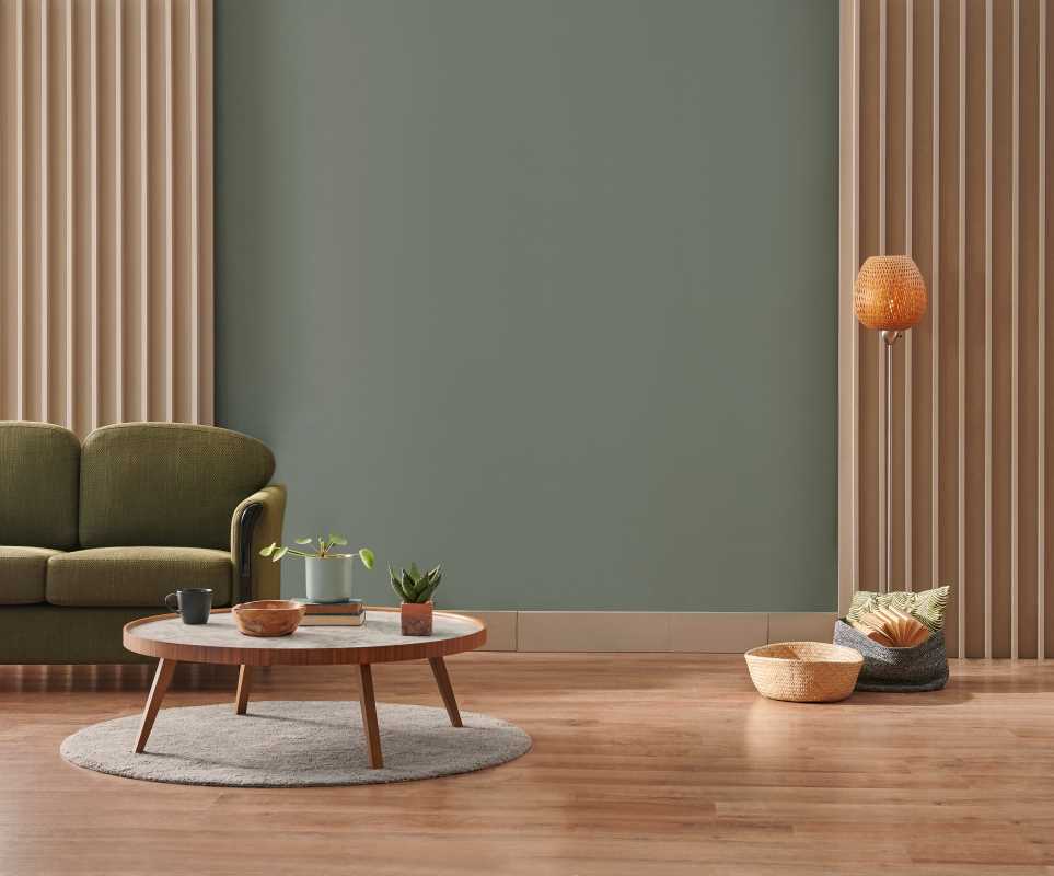
Your living room is the true multi-tasker of the home. It’s for entertaining guests, binge-watching TV, napping on Sundays, and everything in between. Because it serves so many purposes, the color palette needs to be versatile and welcoming.
Warm Neutrals and Greige
You simply cannot go wrong with a warm neutral. Pure white can sometimes feel too sterile for a cozy living space, while heavy beiges can feel dated. The solution is "greige"—a perfect hybrid of gray and beige. Colors like Revere Pewter by Benjamin Moore or Agreeable Gray by Sherwin-Williams are crowd favorites for a reason. They provide a sophisticated backdrop that works with almost any furniture style, from mid-century modern to farmhouse chic. These shades reflect light beautifully during the day but warm up under lamp light in the evening, creating a cozy atmosphere.
Earthy Greens
If you want more color than a neutral but don’t want anything too loud, look to nature. Soft, sage greens bring the outdoors in and have a naturally calming effect. A color like Farrow & Ball’s Pigeon or Sherwin-Williams’ Evergreen Fog adds character without overwhelming the space. Green is uniquely positioned as a "neutral" color in the design world because it pairs well with wood tones, metals, and almost any accent color.
The Kitchen
Kitchens are high-energy spaces. They are places of creation, gathering, and usually a bit of chaos. The best paint colors for kitchens tend to feel clean and appetizing.
Classic White
There is a reason white kitchens have dominated Pinterest for a decade. White feels clean, crisp, and bright—exactly how you want a food preparation area to feel. However, avoid stark, clinical whites. Opt for whites with a slightly warmer undertone, like White Dove by Benjamin Moore. This prevents the space from feeling like a hospital and pairs beautifully with warm wood floors or butcher block countertops.
Deep Navy or Charcoal
For those who want a bit more drama, painting kitchen cabinets (or the walls around them) a deep, moody color is a major trend that feels timeless. A rich navy blue, such as Hale Navy by Benjamin Moore, looks stunning against brass hardware and marble countertops. It adds depth and sophistication, making the kitchen feel more like a designed room and less like a utility space. If you have an open floor plan, a dark kitchen island can serve as a beautiful anchor in a sea of lighter colors.
The Bedroom
The primary goal of a bedroom is rest. This is not the place for high-voltage reds or jarring oranges, which are known to raise heart rates and energy levels. You want colors that signal to your brain that it’s time to wind down.
Soothing Blues
Blue is universally recognized as the most calming color on the spectrum. It lowers blood pressure and mimics the sky and sea. For a bedroom, look for dusty, muted blues rather than bright primary blues. Sherwin-Williams’ Naval is a dark, cozy option for a cocoon-like feel, while lighter shades like Farrow & Ball’s Borrowed Light create an airy, dreamlike quality. These shades work particularly well with crisp white linens and natural textures like linen and rattan.
Soft Blush and Terracotta
Pink isn't just for nurseries anymore. A sophisticated, dusty blush or a muted terracotta can be incredibly warm and flattering. These colors mimic the glow of a sunset and create a soft, romantic ambiance. A color like Setting Plaster by Farrow & Ball has enough brown in it to feel grounded and grown-up, rather than sugary sweet. It’s a surprising neutral that makes everyone’s skin tone look great in the morning light.
The Bathroom
Bathrooms are often small, windowless spaces, which makes paint choice critical. You generally have two routes: go light and airy to fake cleanliness and space, or go dark and moody for a jewel-box effect.
Crisp, Cool Gray
To achieve that high-end hotel spa feel, cool grays and whites are your best friends. They feel hygienic and fresh. A light gray with blue undertones, such as Gray Owl by Benjamin Moore, keeps the space feeling open and bright. This works especially well if you have white subway tile and chrome fixtures.
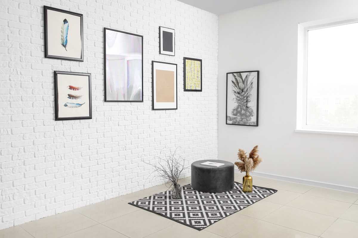
Moody Black or Forest Green
If you have a small powder room (a half-bath for guests), this is the perfect place to take a risk. Because you don't spend hours in there getting ready, you don't need to worry as much about light reflection. Painting a powder room a dark, dramatic color like Tricorn Black by Sherwin-Williams or a deep hunter green creates an instant "wow" factor. It turns a forgettable small room into a design statement.
The Home Office
With more of us working from home than ever, the home office has become a crucial room. The color you choose here needs to stimulate focus and prevent eye strain.
Energizing Teal or Blue-Green
While you want to be calm, you don't want to fall asleep at your desk. A rich teal strikes a perfect balance—it has the calming properties of blue but the energizing warmth of green. Colors like Aegean Teal by Benjamin Moore are stimulating without being distracting. They provide a great background for video calls and help keep your mind alert.
Warm White
If your work involves a lot of visual design or color theory, you might want a neutral backdrop that doesn't cast color onto your work. A warm white keeps the space bright and minimizes eye strain. It also keeps the room feeling open and uncluttered, which is essential for maintaining a clear head during a busy workday.
The Dining Room
Dining rooms are often used in the evening, under artificial light. This makes them the perfect candidate for richer, deeper colors that create intimacy and atmosphere.
Dramatic Charcoal or Aubergine
Dark walls in a dining room act like a hug—they draw people in and encourage long, lingering conversations. A deep charcoal gray or even a rich eggplant color creates a stunning backdrop for candlelight and sparkling glassware. It feels formal and special, separating the dining experience from the rest of the day.
Warm Beige
If you prefer a lighter look, stick to warm tones. Food generally looks more appetizing against warm backgrounds (think creams, reds, and oranges) than cool ones. A warm, creamy beige creates an inviting, hospitable atmosphere that feels like a classic dinner party.
Before you commit to gallons of paint, remember that light changes everything. A color that looks like a soft gray in the store might turn purple in your living room depending on the time of day and the direction your windows face.
- North-facing rooms get cool, indirect light. They tend to make cool colors look even colder. Warm up these rooms with colors that have yellow or red undertones.
- South-facing rooms get intense, warm sunlight. They can handle cool colors like blues and grays beautifully, as the sun will naturally warm them up.